# The Brand Story
It all started back in November 2015, when Mamikos was established as a technology company in Yogyakarta. Then our journey begins by becoming the red lines between anak kos and the kos owners. To simplify all the hesitation that makes looking up kos-kosan easier, friendly, and honest. Therefore at Mamikos, the owners could easily and freely upload and advertise their kos-kosan while the anak kos as the kos-seekers could choose any suitable rumah kos for them to stay and live.
Nowadays Mamikos is an App that offers an end-to-end, a complete solution for managing kos, and a complete choice for kos-seekers or a one-stop solution for kos-kosan in Indonesia.
With more than 6 million active users each month and more than 2 million room listings, Mamikos is a pioneer and the top choice for kos owners and tenants.
Mamikos is the number 1 kos app in Indonesia.
# The Brand Manifesto
Through a clear vision and mission, we hope you are able to get to know us better. This is what guides us to keep going and growing.
# Brand Vision
Upscaling kos industry in Indonesia.
# Brand Mission
Making Mamikos comprehensive solution for kos management and kos rent matters
# Slogan
Slogan is statement, well in our case it’s a bold statement, it is what distinguishes us from others. It’s a statement that Mamikos has been chosen and trusted by many.
Aplikasi Kos No.1 di Indonesia
# About Mamikos Logo
Our Mami is a representation of a mother in kos. Inspired by the care and perseverance figure that we represent as mother.
# Logo Elements
Mamikos logo is a combination of two elements. These two elements are often inseparable, except for an app icon then we use Mami icon.
# Icon
While the icon can exist without the wordmark, the wordmark should never exist without the icon.
# Logo Variations
A brand logo travels places, from mobile app to bill boards, brochure, TVC, etc. Every medium offers a unique challenge in communication and consistency, which creates a need for logo variations.
# Icon
It’s a picture worth a thousand words.
# Horizontal
Used at anytime and any medium when icon and wordmark appear in pairs
# Logo Misuse
It's important to pay attention to the consistency of the logo's appearance. It is forbidden to add, change or modify the logo of the Mamikos. There are no exceptions.
# Safe Area and Logo Appearance
As with all matters of heart, our logo needs its space. When the logo is placed against other visual elements, the minimum safe area provides a breathing space for the logo. This maintains a visual emphasis essential for brand identity.
The logo and the icon’s exclusion zone is equal to half the height of the icon (marked as × in the diagram)
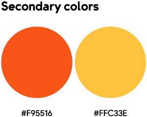
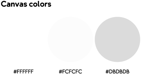
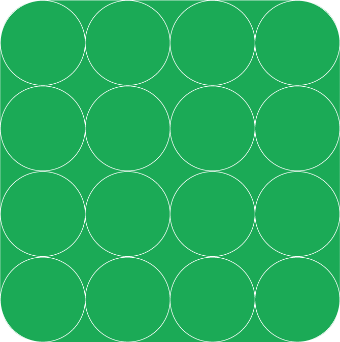
# The Colors of Mamikos
Mamikos main color is always green, and our premium/secondary color is orange. While we can (And we would) using other colors for optimization and accessibility, our resting color is always green.


# Brand Typeface 1
A place to introduce the brand values of Mamikos and typography. The importance of readability, clarity and presentation.


# Brand Typeface 2
A place to introduce the brand values of Mamikos and typography. The importance of readability, clarity and presentation.


# Signature Shape
Ours is inspired by a window.
It’s a thing we open when we want to get fresh air, it’s also a place to wander and thinking of an idea, or thinking of someone special.
Windows gives us the opportunity to see the beauty of the outside world without having to travel
We wanted to immortalize that precious moment into our signature shape.
# Compositions
A brand iconic shape should be inspired by the objects that are always there in its daily business. Ours is inspired by a window
There’s always a window in kos, and a window in kos is not just a window. It’s a thing we open when we want to get fresh air, it’s also a place to wander and thinking of an idea, or thinking of someone special, or staring at the rain.
We wanted to immortalize that precious moment into our signature shape
Placement of image and copy
We wanted to make it flexible that whether it’s the
copy or the image that put inside the “window”. Its
flexibility very much needed to overcome a wide
range of visual needs.
Vertical
Horizontal
# Mamikos Logo Portion and Appearance
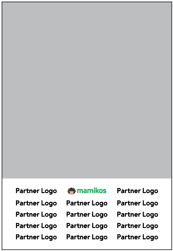
Single Partnership
Multiple Partnership